On Tuesday, the United States elected its representatives for the next session of House of Representatives. Some of the races are still too close to call, but that doesn’t mean it’s too early to start plotting!
I decided to give the map a go since I haven’t seen many examples of how to create election maps in Python. I used pandas, matplotlib, and Cartopy for everything from downloading the data to creating the map.
import pandas as pd
import numpy as np
import matplotlib.pyplot as plt
import matplotlib.gridspec as gridspec
import cartopy.crs as ccrs
from cartopy.io import shapereader
from cartopy.feature import ShapelyFeature
I pulled the House results from a spreadsheet maintained by David Wasserman & Ally Flinn of Cook Political Report. I then used a table from the U.S. Census to map the Congressional District shapefiles to the results.
# Download election results data.
house = pd.read_csv(
        "https://docs.google.com/spreadsheets/d/1WxDaxD5az6kdOjJncmGph37z0BPNhV1fNAH_g7IkpC0/gviz/tq?tqx=out:csv&sheet=Sheet1",
        skiprows=[1,2],
        dtype='S'
)
# Download table mapping state names to FIPS state codes.
fips = pd.read_csv(
        "https://www2.census.gov/geo/docs/reference/state.txt",
        sep='|',
        dtype='S'
)
fips_dict = fips.set_index('STATE_NAME').to_dict('index')
house["FIPS"] = [fips_dict[x]["STATE"] for x in house["State"]]
To ensure consistent results I can test, I created a small function to map the winning party to the Federal Information Processing Standards (FIPS) state codes and district numbers.
def winner(fips, dist):
        try:
                if dist != "00":
                        dist = str(int(dist))
                else:
                        return house[(house["FIPS"] == fips)]["Party"].values[0]
                return house[(house["FIPS"] == fips) & (house["CD#"] == dist)]["Party"].values[0]
        except:
                return None
With all the pieces in place, I created the map.
reader = shapereader.Reader(shapes)
shapes = [ShapelyFeature(x, ccrs.PlateCarree()) for x in reader.geometries()]
recs = list(reader.records())
fig, ax = plt.subplots(figsize=(20, 15))
projection = ccrs.AlbersEqualArea(central_longitude=-100)
ax = plt.subplot(111)
ax.set_visible(False)
# Continental United States
ax1 = fig.add_axes([-.05, -.05, 1.2, 1.2], projection=projection)
ax1.set_extent([-125, -66.5, 20, 50])
# Hawaii
axhi = fig.add_axes([0.25, .1, 0.15, 0.15], projection=projection)
axhi.set_extent([-155, -165, 20, 15])
# Alaska
axak = fig.add_axes([0.1, 0.1, 0.2, 0.2], projection=projection)
axak.set_extent([-185, -130, 70, 50])
# Get rid of anything extra: boxes, backgrounds, etc.
plt.box(False)
for subplot in [ax1, axak, axhi]:
        subplot.background_patch.set_visible(False)
        subplot.outline_patch.set_visible(False)

fig.patch.set_visible(False)
plt.axis('off')
# Draw the shapes
for i, shape in enumerate(shapes):
        win = winner(recs[i].attributes["STATEFP"], recs[i].attributes["CD115FP"])
        if win is "R":
                color = "#F8766D"
        elif win is "D":
                color = "#619CFF"
        else:
                color = "#CCCCCC"
        if recs[i].attributes["STATEFP"] == '02':
                a = axak
        elif recs[i].attributes["STATEFP"] == '15':
                a = axhi
        else:
                a = ax1
        a.add_feature(shape, color=color, linewidth=.25, edgecolor='w')

plt.savefig(filename)
plt.clf()
filename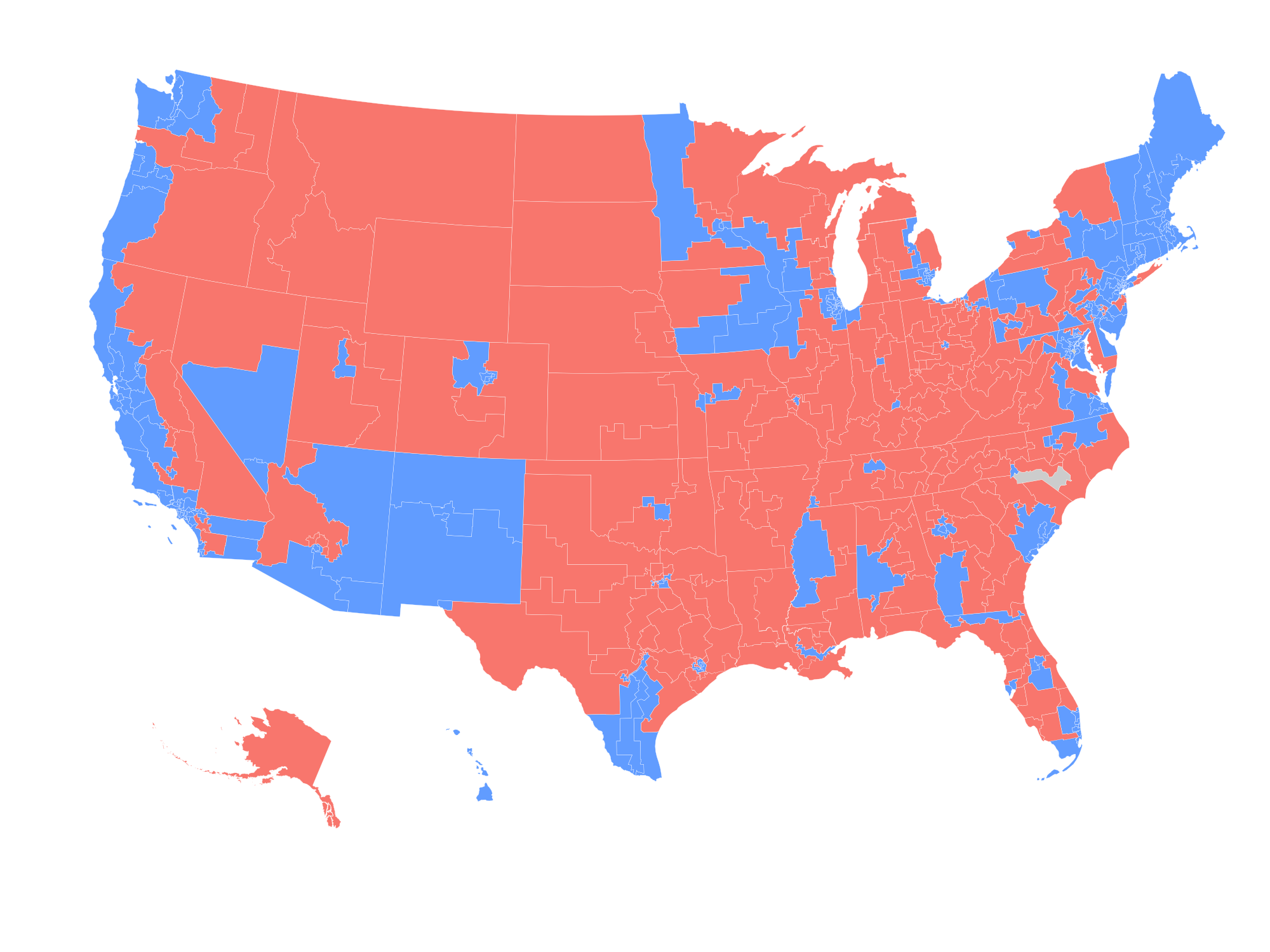
Maps like these are a bit deceptive because the area maps to land area, not population. I probably wouldn’t use this graphic to represent the election results, but it was still a fun activity and shows how to get started with mainstream Python graphic tools.
I updated this post to show the results as of December 5, 2018.